設計公司:新加坡soda設計事務所(全稱:spirit of design analogy pte ltd)
項目地址:新加坡
紅色光譜
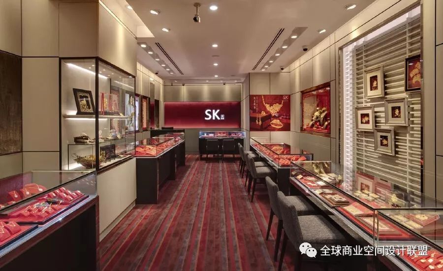
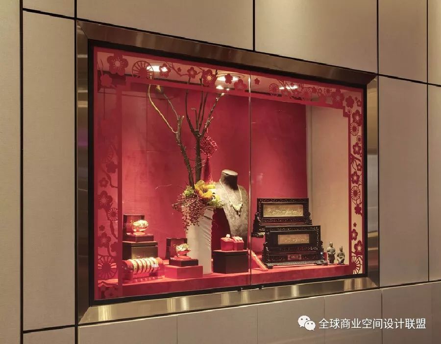
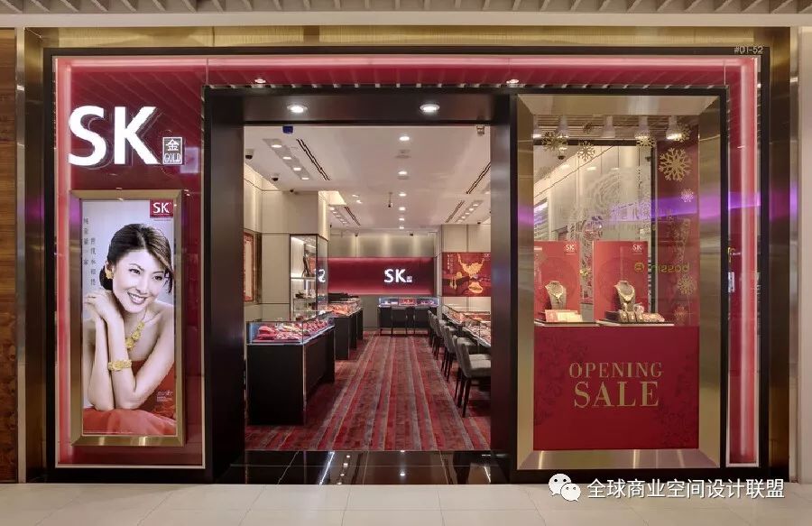
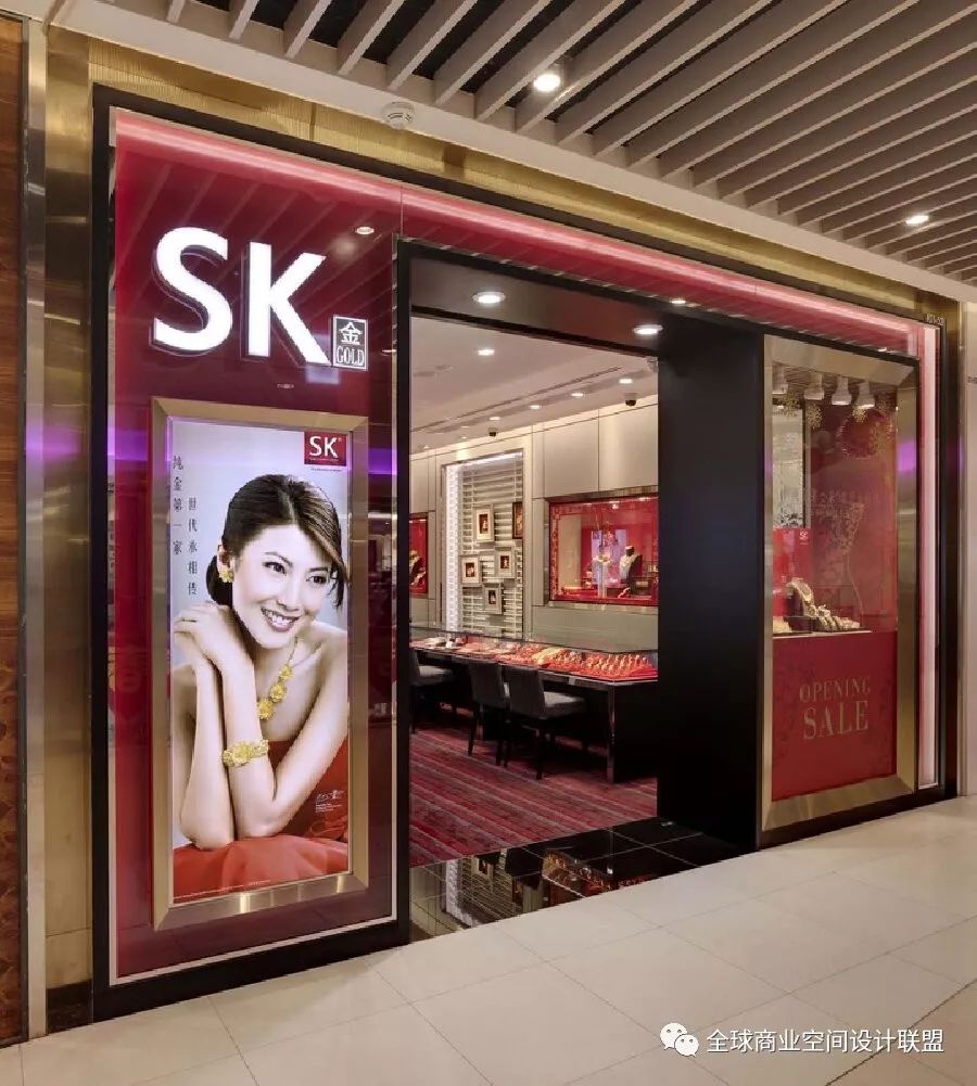
專爲傳統信仰而設計,將黃金作爲珍貴的珠寶。Soda重申了在現代環境中欣賞黃金的想法。紅色的壯麗被視爲充滿激情的愛情和感官享受的風景,以慶祝黃金是婚姻和聲望的基本象征。內牆被分割成不同的顯示模式,包括各種珠寶和信息圖形,自然形成網格和平面的拼貼。黑色線條和框架巧妙地突出了這一構圖,以進一步強調産品的藝術性。
Spectrum of Red
Designed for a traditional belief of embracing gold as precious jewellery. SODA reiterated the idea of appreciating gold in the modern context. The grandeur of Red is perceived as a landscape of passionate love and sensual bliss to celebrate gold as the essential emblem of marriage and prestige. The interior walls are segmented into various modes of displays to encompass a wide range of jewelleries and info-graphics which naturally forms a collage of grids and planes. Black lines and frames subtly accentuate this composition to allow further emphasis on products as pieces of art.
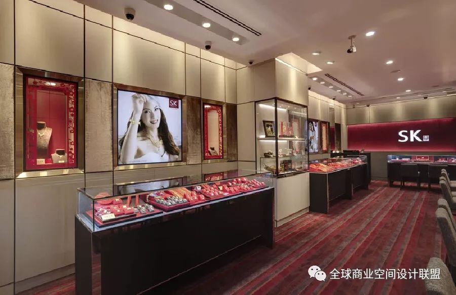
 這是一個賦予傳統黃金飾品店全新定義的設計。新加坡SODA設計事務所致力于運用新穎的手法展現金飾的傳統意義,大膽地大量采用搶眼的紅色爲基調,表達出熾熱的情感和感官上的沖擊,同時也襯 托出耀眼的金飾在華人傳統婚姻像征的重要地位。室內空間的牆面劃分成了大小不一的板塊,分別由各式的展示櫥窗和産品海報組合而成。當中黑色的分隔線內斂地將各個板塊分割開來,卻又不會讓人覺得唐突,讓整個室內空間滲透出一絲絲有別于一般商店的氣質,仿佛是一間富麗堂皇的藝術畫廊。
This is a design that gives a new definition to traditional gold jewelry stores. Singapore SODA Design Firm is committed to using innovative methods to show the traditional significance of cash decoration, boldly using a large number of eye-catching red as the keynote, expressing the passionate emotional and sensory impact, but also set off the important position of dazzling gold decoration in traditional Chinese marriage symbols. The walls of the interior space are divided into different sizes of plates, which are composed of various display windows and product posters. Among them, the black dividing line divides the various sections implicitly, but it does not make people feel abrupt, so that the whole indoor space permeates a trace of different from the general store temperament, as if it is a magnificent art gallery.